FaceDancer
Experimental mobile game for capturing fake emotions
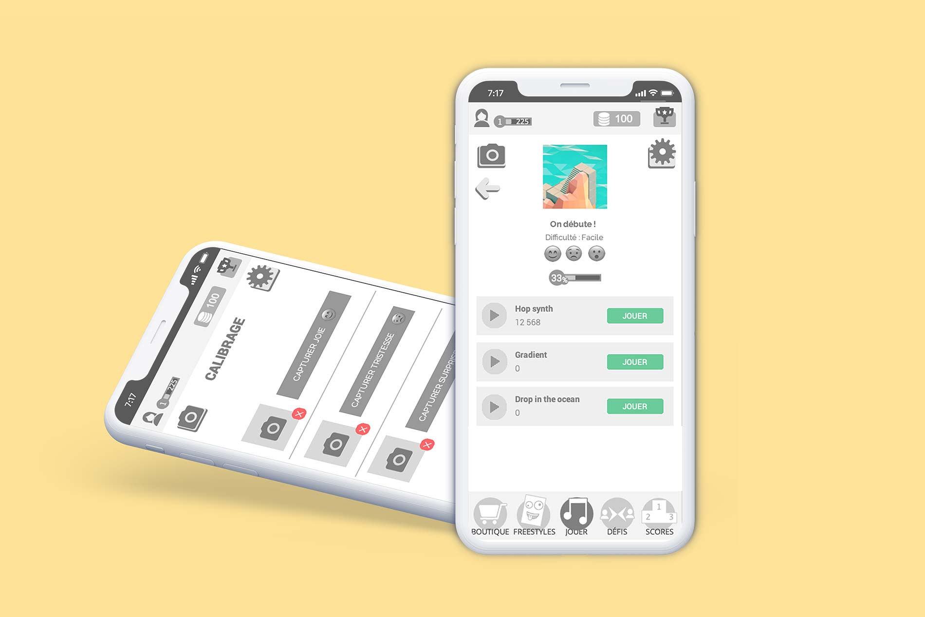
Experimental mobile game for capturing fake emotions
FaceDancer is a mobile game where the player controls the actions of the game by the movements of their face. The principle of the game is inspired by games such as Guitar Hero/Beat Saber, except that in order to succeed notes, you have to succeed facial movements (fake emotions).
My role: UX Designer
Team: 9 people (developers and artists)
Date: September 2019
Tools: Illustrator, Unity, JustInMind, Miro
The goal was to accelerate my former company’s needs in scientific research. Data was collected for helping develop the pain algorithm.
This was an experimental game concept.
Would the player be eager to play with their face as an input for interaction? What are the stakes on data processing, including ethics and legal concerns? How to make the experience enjoyable and fun?
FaceDancer should allow players to contribute to scientific work in a controlled, interactive, accessible and fun way.
I've identified good and bad ideas from other mobile games, including music games.
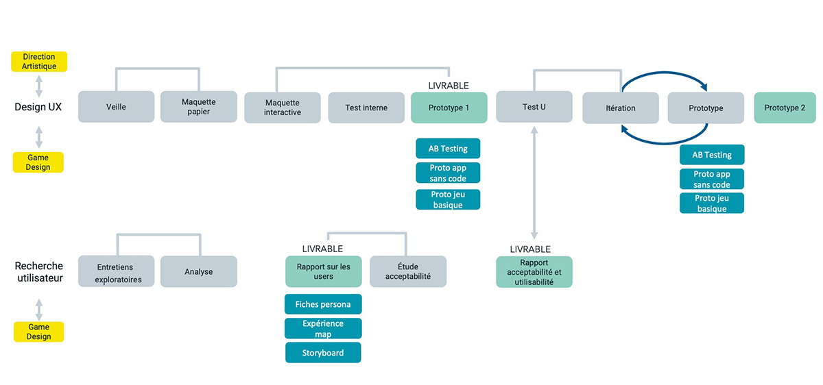
During an exploratory phase, we interviewed 6 people between the ages of 14 and 25.
Following the analysis of our interviews, we have identified patterns regarding interests and motivations.
I made personas that represent fictional people. This helps the team understand our target users.
I made an experience map in order to help visualize the story of our potential users playing our game.
I did some sketches on paper and created an interactive prototype.
I did the user flow in collaboration with the game designer. This tool allows you to understand the path to follow in order to accomplish a task in the game app.
We've put the app aside to focus on what's important: the game. Is it easy to understand? Is it fun?
The next step is to conduct more testing to better identify the type of people who might like this game.

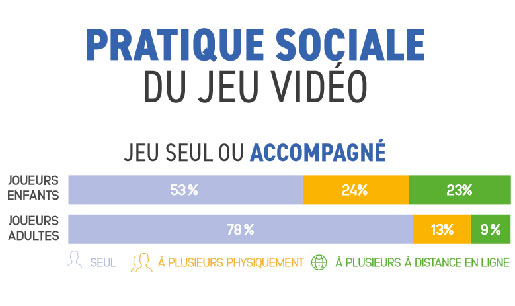
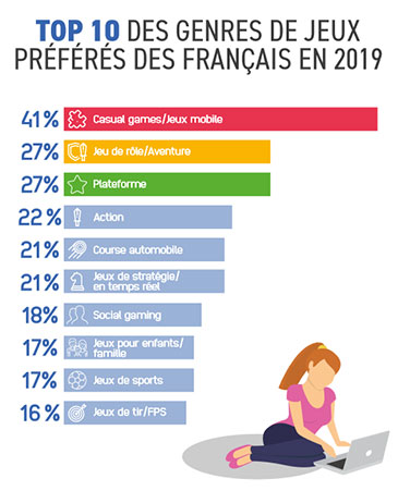

We conducted an exploratory research on the mobile gaming market and a cognitive research on the perception of the virtual avatar.
Among other things, this helped me to create an interview script for users and to combine quantitative and qualitative research.
Sources : AFJV, photo credits Robin Worral, Yura Fresh (Unsplash)
I continued the research on target users.
To do so, I asked approximately 40 questions to potential target users during a 45-minute session.






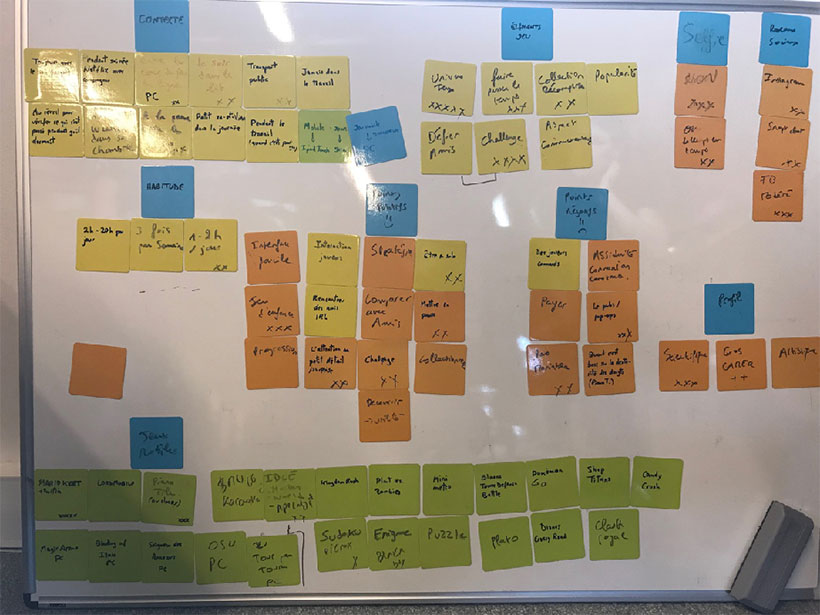
Following these interviews with users, we created an affinity diagram in order to identify patterns and facilitate the creation of personas.
This tool helps to arrange data and explore information critically, and often in an unexpected way.
A potential target is likely to be young people aged 14 – 25. Another secondary target may be people in their 30s and 40s for whom the scientific search for pain is a motivation, such as Jean-Baptiste:
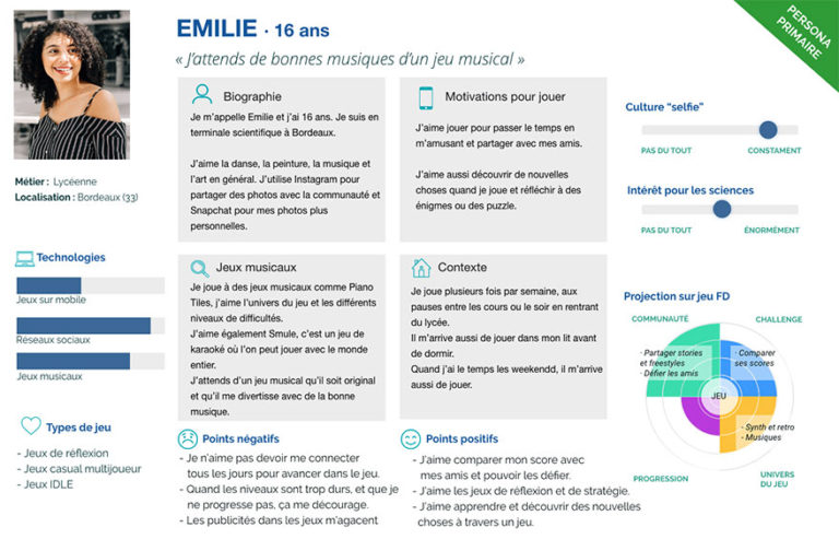
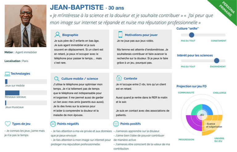
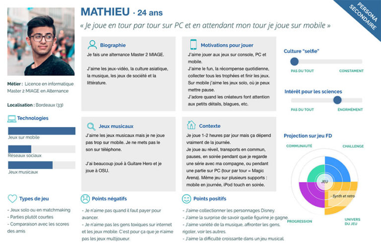
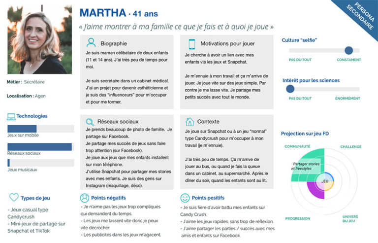
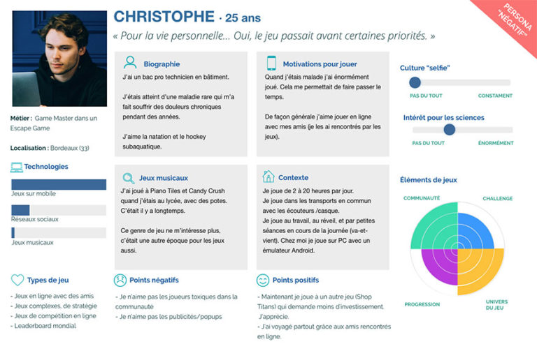
All of these supports, including personas, are communication tools that help align development, marketing, design teams and other stakeholders.
This gives life to personas and helps the team to see how the game could be played and by whom.
I quickly sketched some UI ideas on paper.
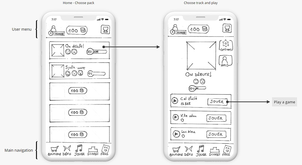
Basic and compact version with a classic navigation flow. I chose this functional version for prototyping.
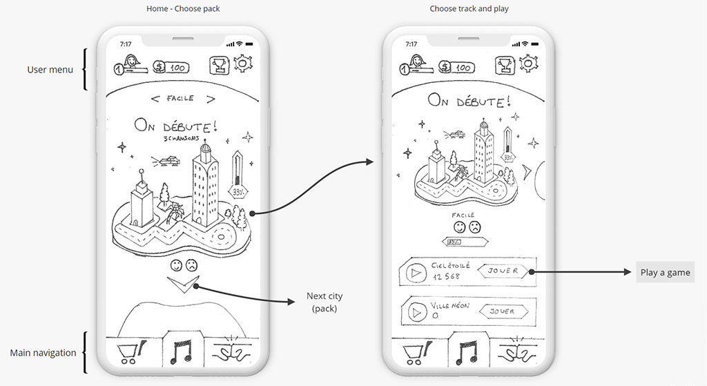
I looked for a more original and dynamic alternative idea and proposed a UI with retro-futuristic cities.
Each city represents a pack of levels.
If we validate this idea, our team of 3D artists could design a nice little 3D environment.
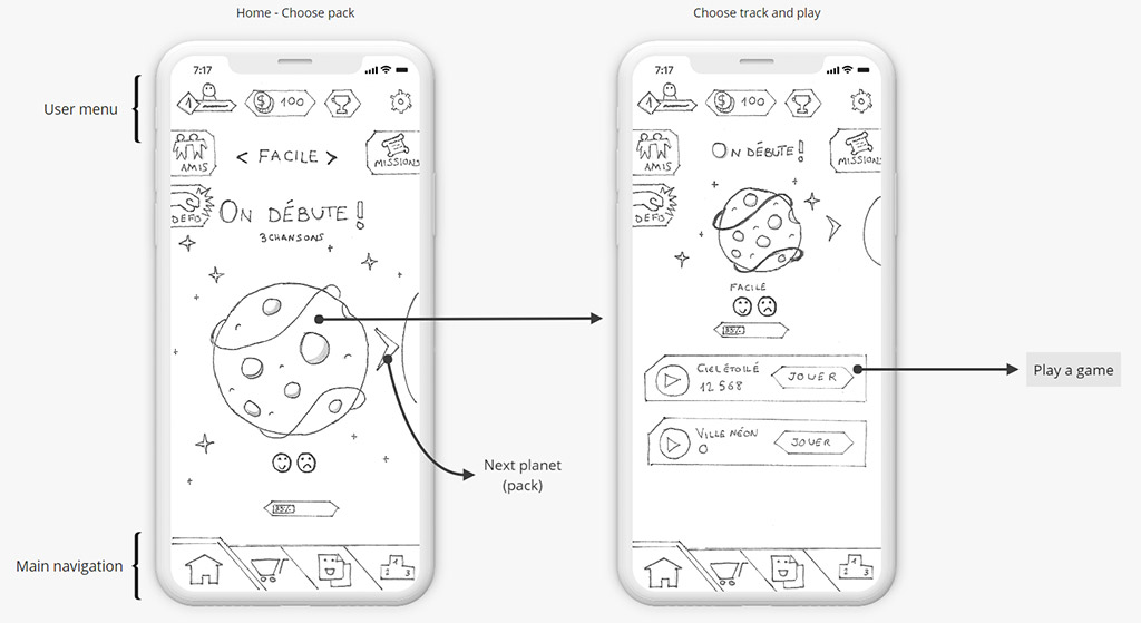
How about planets around a solar system?
I propose that each planet could correspond to a level pack.
This idea could also be made in 3D and bring a strong identity to the game.
The user flow is the path a user follows through the application interface to accomplish a task:
The flow is different if it is the first time the user plays.
Capturing one's emotions must be fun and intuitive.
From the main menu user should be able to find the main navigation elements.
Once in a song pack, the player should be able to choose a song easily
The main task to evaluate the usability. That is to say: being able to launch a game easily.
I conducted a proof of concept with a prototype. A proof of concept is a preliminary, short and incomplete experimental product in order to demonstrate its feasibility.
In close cooperation with the game designer, we defined the UX / Game Design questions for the proof of concept.
Innovative and challenging factors converge in this project: capturing emotions, playing with one's face, and accelerating scientific research to finally "feed" an algorithm that will help relieve pain.
In collaboration with the game designer, we have established 2 game hypothesis:
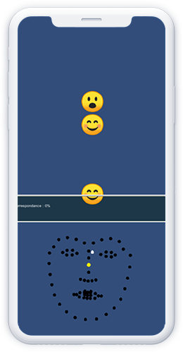
«Avatar» hypothesis: The player’s emotions are displayed in real time on a virtual avatar.
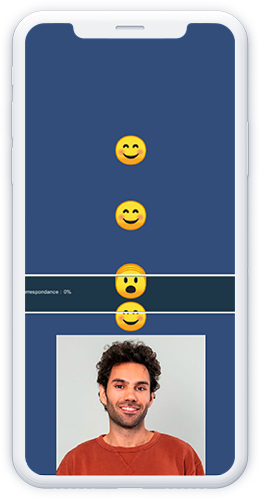
«Camera» hypothesis: The player sees their image in real time.
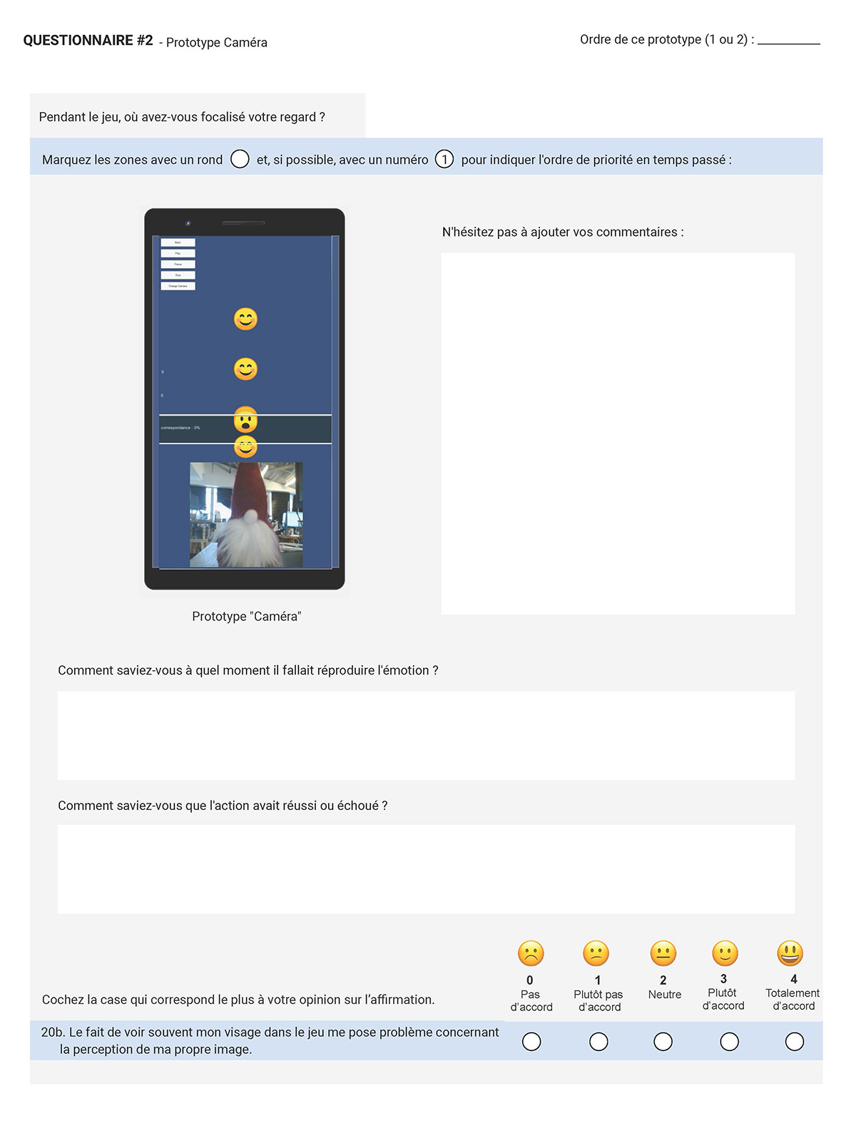
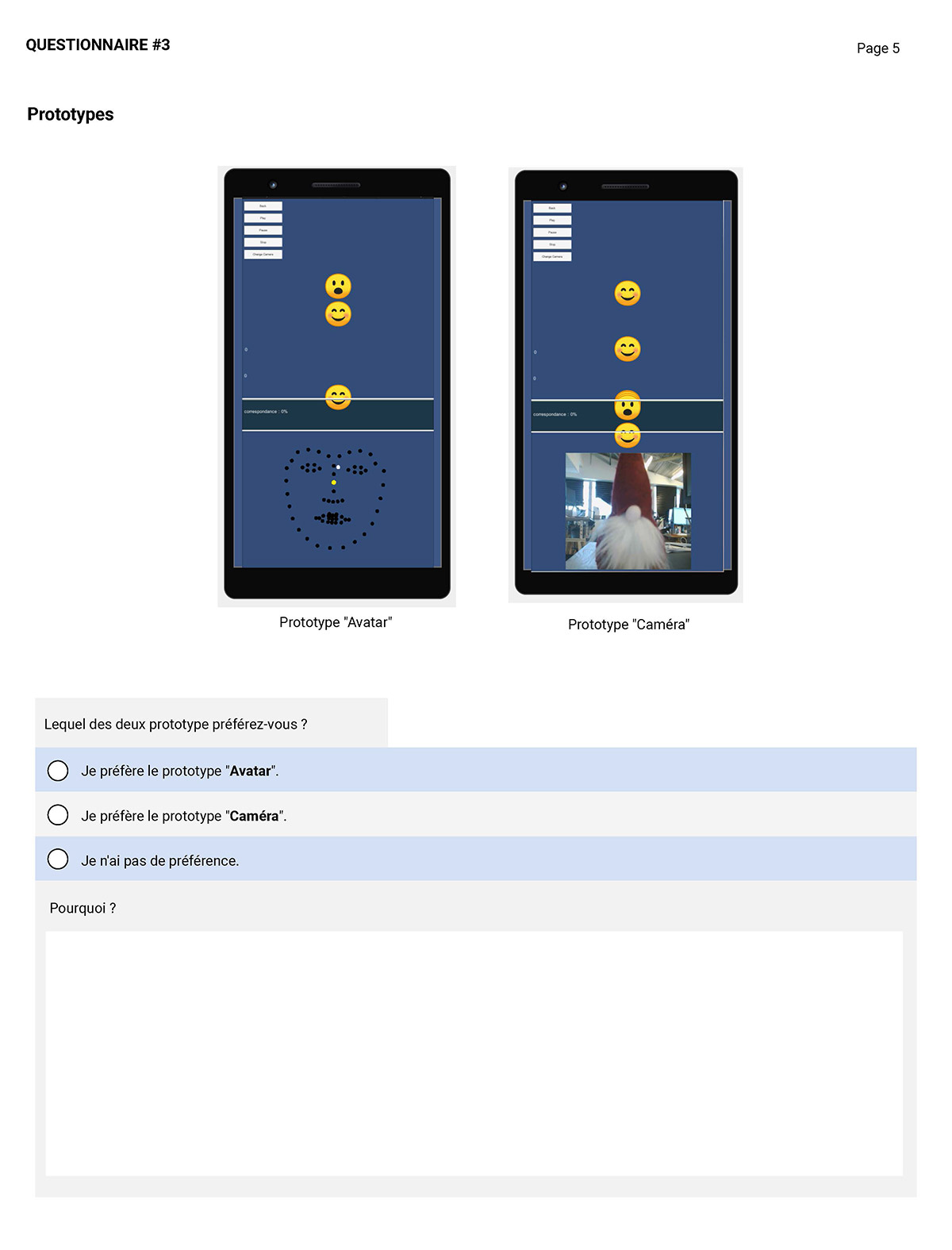
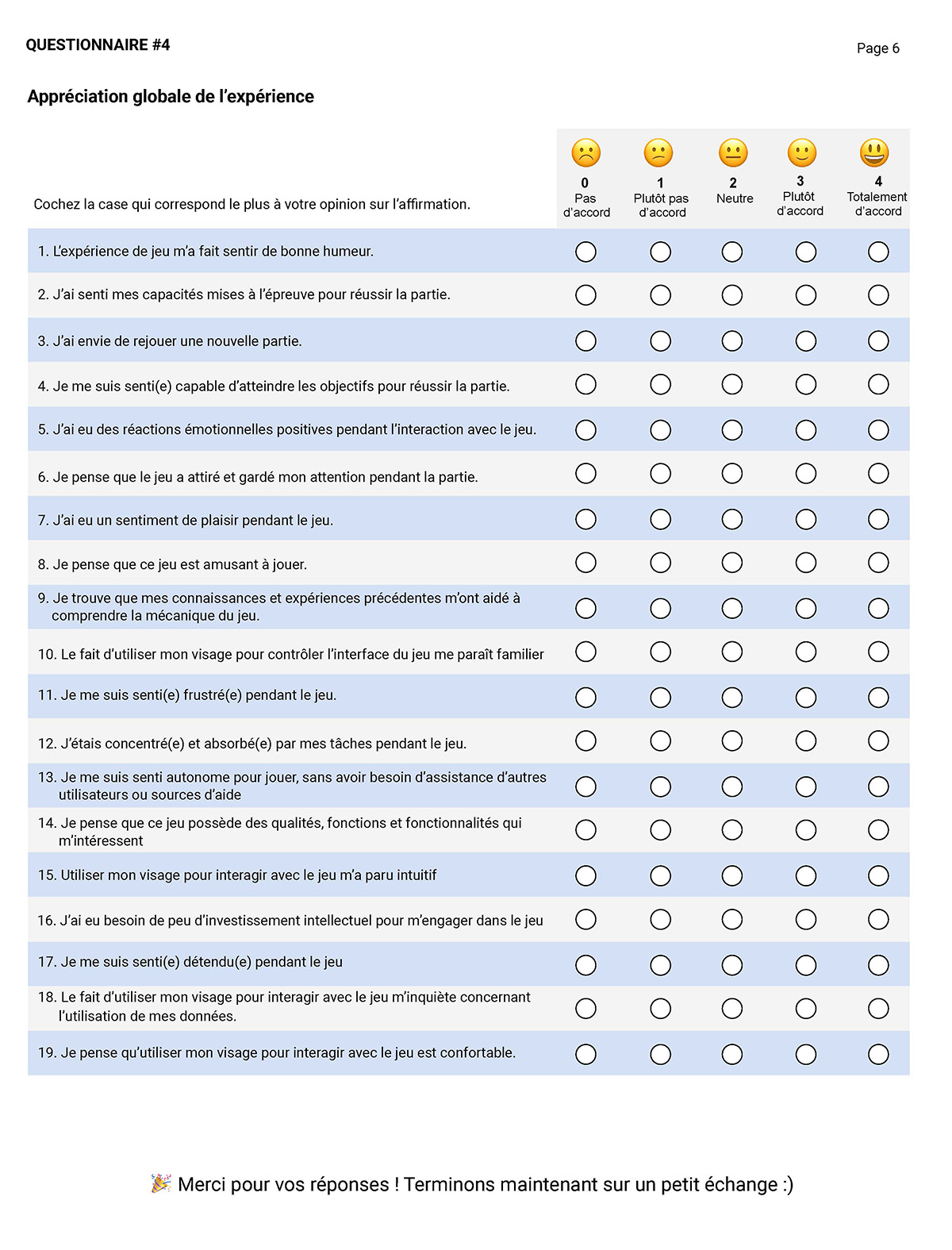
I carried out questionnaires to obtain objective and quantifiable data.
I did not find a questionnaire on acceptability that was scientifically validated and adapted to our “game” and technological innovation context.
I did some research of scientific literature and UX. More specifically, one of these articles helped me write the research protocol: Acceptability Engineering: The Study of user Acceptance of Innovative Technologies.
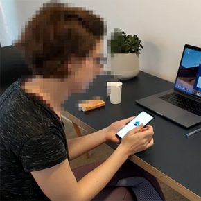
I led the sessions with 6 participants. In the first phase the participant tested the prototype of the app, and then tested the two hypotheses of the game prototype.
3 participants played the hypotheses in order AB, then the other 3 participants played BA.


Following the results of the proof of concept, we haven't found any conclusive results that make us think that the current prototype of the game is sufficiently playable and fun.
The project was put on hold indefinitely by my former employer.
I was still able to put into practice a UX vision and collaborate with the game designer and programmers of the project 🙂.
Posted on December 14, 2019 By Maga
Categories: Professional, UX, Video game