Evaluation of a VR app for pain relief
User experience of a virtual reality application for pain relief
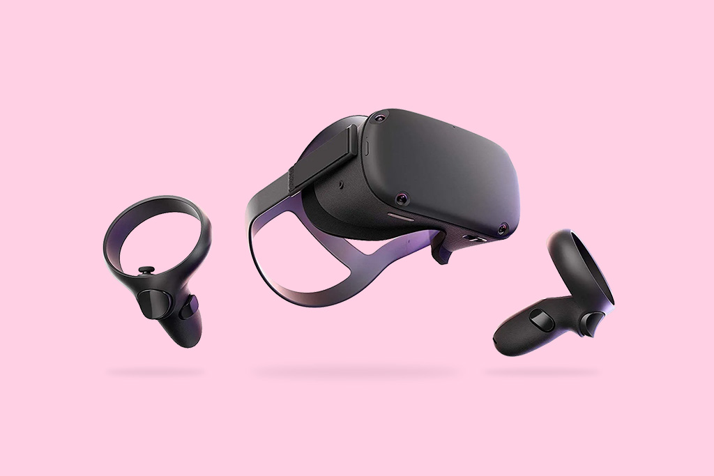
User experience of a virtual reality application for pain relief
My intention is to share my design thinking process for evaluating the user experience of virtual reality (VR) products.
This article collects my professional experience as UX Researcher & Designer, without any information about the projects I participated in.
I have signed a non-disclosure agreement with my former employer.
This publication is a personal article. Any views or opinions represented in this publication are personal and belong solely to me. They do not represent my employer.
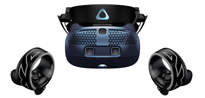
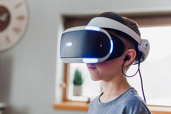
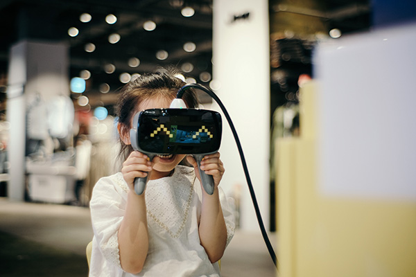
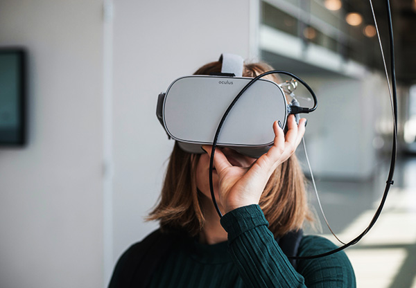
Recent articles support the hypothesis that VR therapies can effectively distract patients with chronic pain (Virtual Reality as a Clinical Tool for Pain Management, PubMed.gov).
The patient’s immersion in virtual reality provides a distraction from painful stimuli and can reduce the perception of pain.
VR can also help reinforce the effectiveness of techniques such as physiotherapy, hypnosis and cognitive behavioural therapy to treat chronic pain (Virtual Reality as Therapy for Pain, New York Times).
Image sources : Insung Yoon, Jessica Lewis, Maxim Hopman (Unsplash) / Vive.
An immersive, relaxing and interactive VR application can keep the brain so busy that it has no room to process pain sensations at the same time.
From a UX perspective, a VR product designed to relieve pain has two components:
The person, beyond their condition as a patient, is an individual with their own mental model.
Stimuli specifically designed to change the perception of pain.




As a UX Researcher, what interests me most is the pure “user experience” level.
The person, beyond their condition as a patient, is an individual with their own mental model: their technological culture, their emotions and their own cognitive abilities.
If the user experience is inadequate, it will be in conflict with the ultimate goals of the therapeutic procedure.
A good UX strategy must guarantee everything related to the interaction of the individual with the system.
UX evaluation tests will help identify areas for improvement. Once a satisfactory point has been reached, we can focus on the scientific part and work on the stimuli, their active principles and their validation under scientific study conditions.
Scientific and UX literature can help us ask the right questions and guide the research. Here is a selection of articles:
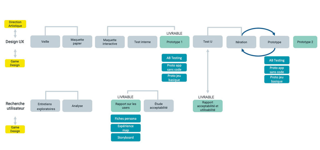
The evaluation varies according to the complexity of the project. Globally, we have these steps:
Identify each step and criteria. Document all UX work.
Define clear and measurable goals. Write the script for the user testing.
Test the prototype as soon as possible with a minimum of 5 target users.
Analyze the sessions and obtain clear and objective conclusions.
Present results to stakeholders to assess feasibility and priorities.
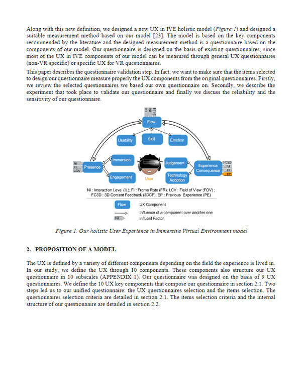
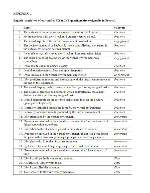
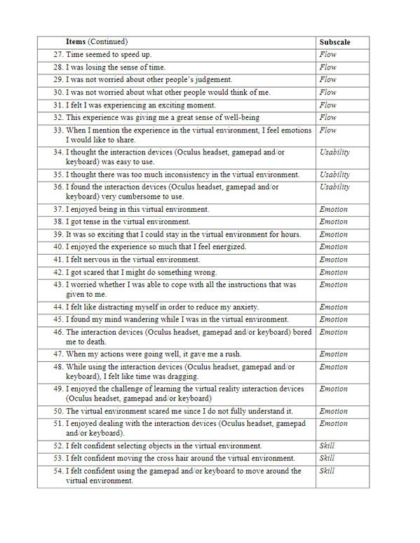
After testing the product, the user is asked to complete a user experience evaluation questionnaire.
The questionnaire is based on a set of criteria that collects the user’s opinion and preferences on the virtual environment, as well as their state of possible cybersickness. It is completed by the participant immediately after testing the virtual reality application.
For each project I adapt the questionnaire, but my work is especially based on Katy Tcha-Tokey’s thesis published in ResearchGate.
The questionnaire proposed by this publication is a unified questionnaire based on nine other existing questionnaires (PQ, ITQ, Flow4D16, CSE, AEQ, SUS, UTAUT, AttracDiff, SSQ).
One of the criteria that interests me is the flow. Flow is characterized by the complete absorption in what one does with a feeling of immersion and enjoyment (Wikipedia).
More specifically in video gaming, the “game flow” (The Gamer’s Brain, Hodent) is essential for successful engagement of the gamer or, in our case, the future patient, to finally succeed in the therapeutic treatment.
The participant completes a questionnaire on their demographic and technophile profile and a questionnaire on cybersickness.
The participant tests the VR application. Unlike UX standards, the "think aloud" method may not be advisable as it may break the immersion.
During the session (which is recorded) the moderator can complete an observational analysis grid.
After the test, the participant completes the experience evaluation questionnaire and once again the cybersickness questionnaire.
Qualitative interview led by the moderator with questions that do not lead or bias the answers.
It formally completes the testing. We can thank the participant.
I invited my colleagues (game designer, 3D artist, sound designer, etc.) to attend the test sessions. Thanks to their involvement, they have a better understanding of the UX mindset and they can better understand the final user.
Finally, when the UX team effectively shows tangible, proven results like those of a test session, it’s easier to align the entire team for the next iteration.
UX testing for a VR app of pain relief must be part of an overall strategy of user-centered design.
Conducting tests early in the production process is essential to effectively identify design problems. Detected later (“we don’t have time, we’ll do the UX after…!”) the danger is that the product will end up being tested and evaluated too late, at a time when nothing can be done or only quick fixes can be applied.
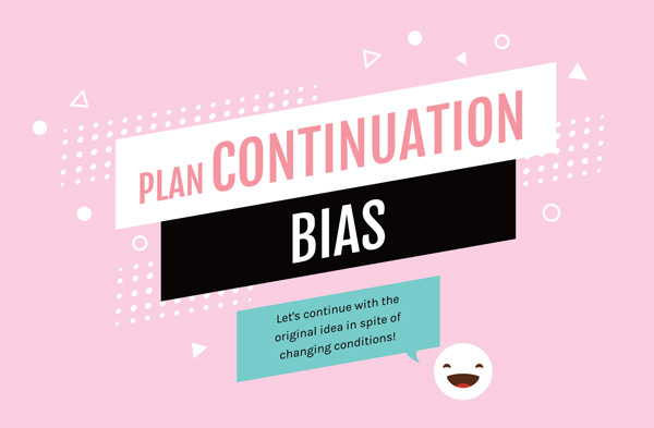
We should keep in mind the plan continuation bias (Sunken Fallacy), especially known in aviation safety.
According to this bias, humans tend to reject new options because they have spent a lot of time in the original plan.
Hence the interest of carrying out tests early in the production process.
Finally, it’s all about never stop learning and seeing how a user, whether a is gamer or a patient, understands and interacts with our system without outside help. The UX Researcher must fill the gaps between the mental model of the user and the mental model of the designers.