Sekiro
Analysis of the user experience of Sekiro and new UI proposal
Analysis of the user experience of Sekiro and new UI proposal
In this study I make a UX analysis of the game Sekiro and a proposal of a new mockup for the inventory screen.
It is with profound respect and admiration for the creators of Sekiro that I share my thoughts and research ideas.
I take a closer look at the target audience and highlight the interest of aligning their mental model with the objectives of the game's creators.
I analyze the onboarding of the game and show examples that would be worth thinking about.
I analyze the game-feel and I show some interesting examples.
I analyze the game's interface, especially the inventory interface.
I made some paper mockups first. Then, I made a digital version with Sketch.
I created an interactive prototype with Protopie to test my ideas quickly. I also exchanged with other Sekiro players.

Miro

Sketch

Protopie
Sekiro is a game acclaimed for its game experience that provides a relentless and merciless difficulty for its players.
I don’t know the objectives and reasons behind every design choice made by the Sekiro team.
But I can’t help it and I ask myself:
There are several UX research methods for developing player-centric games from the earliest stages of design.


A persona (Nielsen Norman’s definition of persona) is a fictitious but realistic description of a typical or target player of the game.
Aligning the game with its target does not mean that UX will make the game “easy”, or remove the “frustrations” of the players (5 Misconceptions about UX in Video Games, Hodent).
Basically, if you want to make a sadistic game like Sekiro, the UX recommendations will definitely help you achieve this goal 😉.
As UX Designers, the only thing we are interested in is avoiding deficient interfaces or counter-intuitive interactions.
Game designers can relax, we are their allies!
Whether it’s a film, software or service, details are just as important as the most obvious elements of a design. These big little details contribute greatly to making the Sekiro experience as engaging, fascinating and unique as it is.
Drinking an empty gourd during the game can become a fatal mistake as Sekiro loses precious seconds in a battle.
In another game with different objectives, the object would disappear from the character’s equipment so as not to punish the player. This is not the case in Sekiro.
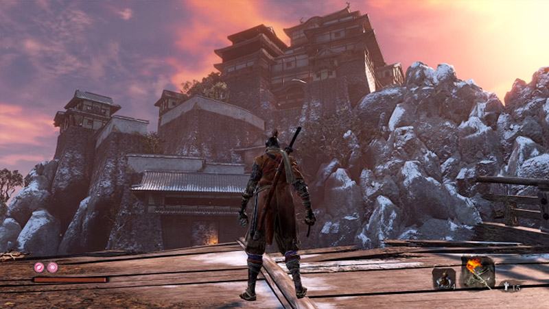
At the beginning of the game, when I found myself on Ashina’s broken bridge, I literally had no idea where to go or what to do. I had to explore, go back, come back, look around…
In this semi-open world we have no clue about an “active quest”, no orientation system as other games we can be used to (Grand Theft Auto, The Witcher III…). It’s a real back to basics (Zelda Link to the Past, Secret of Mana…).
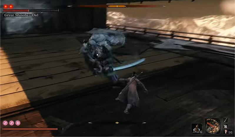
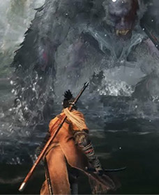
Everything you feel, facing these spectacular bosses, is fear.
And yet, to dodge an attack of titanic proportions, you have to dodge towards your own enemy.
In Sekiro, you are forced to change your habits.
All the players' schemes, experienced or not, are upset by the twisted spirit of the creators of this game.
It’s a whole other way of playing that is being forced upon us. And yet it works.
Some players will give up their quest… But those who reach the end will have completed the strange and unusual journey offered by this game. It’s simply amazing.
Despite the level of mastery of its creators and their precise intention behind every detail, many questions arise about certain design choices.
From Software’s games (Bloodborne and the Dark Souls saga) are known for their poor onboarding and faulty interface, almost counter-intuitive.
Somehow, the lack of onboarding and the interface are part of the charm of From Software games.
Indeed, not having an easy to learn experience and interface, plus the fact of “hiding” certain features, can give a very strong sense of exclusivity and community to its users.
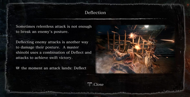
Om this forum discussion, a player complains about being penalized because of popups, probably from the onboarding:
I’m running away from the enemies when a popup stops the game flow to explain me the “Deflection” system. I don’t understand why… aah, I do! It was an enemy behind me who was going to attack me!
Sekiro is more accessible than its predecessors thanks to a better interface and its onboarding system.
However, there are a number of examples that deserve a review.
In the video example, a popup suddenly stops the game. The text is long and the image is illegible.
The text also mentions the concept of posture, without image. At this stage of the game, we do not yet understand what the posture represents.
In this example of onboarding in The Last of Us, the player learns to reload their weapon for the first time:
Great example of onboarding in The Last of Us: the information is contextual, within the narrative and without interrupting the game.
A good hierarchy of information is essential to ensure that information is found and discovered with a good learning curve.
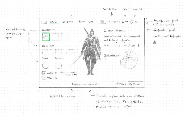
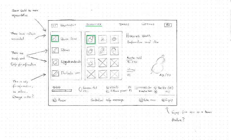
My goal is not to review the entire information architecture of the game’s UI. I focused on the analysis of the Inventory:
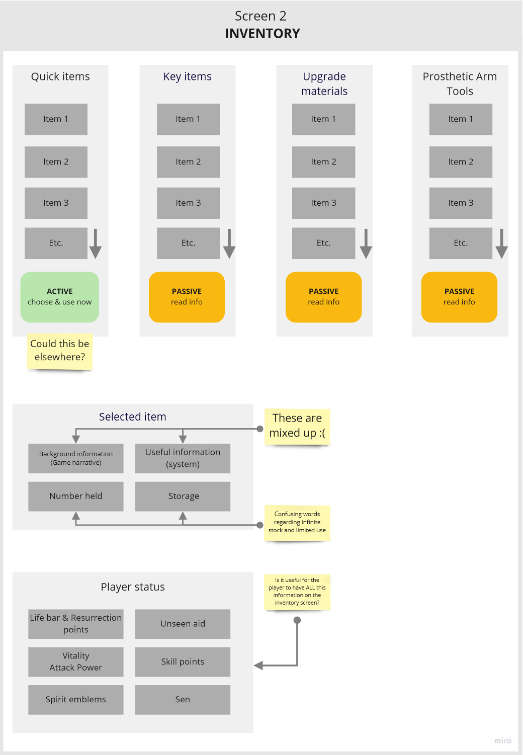
Information architecture of the Inventory screen. I’ve analyzed more screens. They’re available on this link..
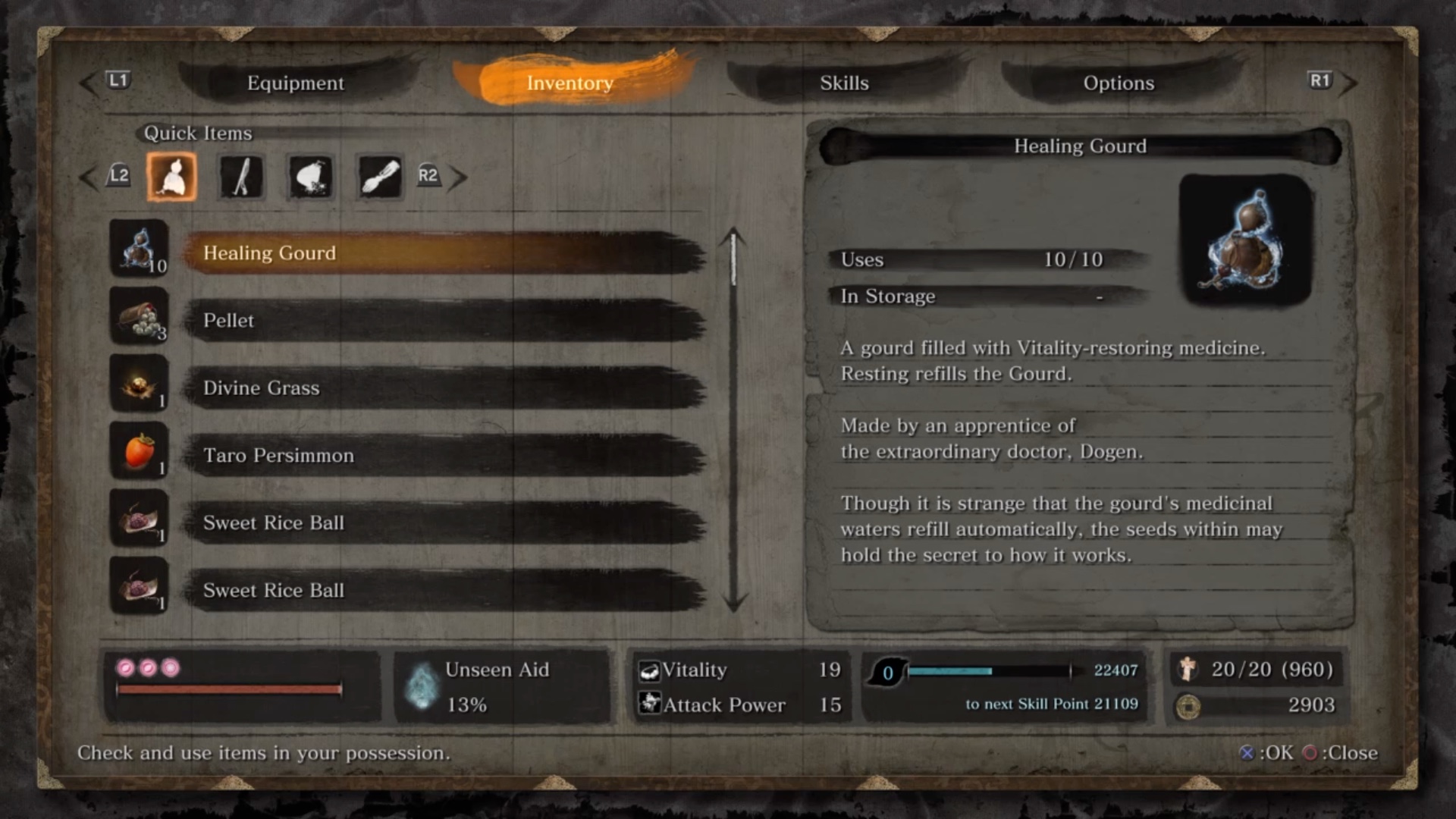
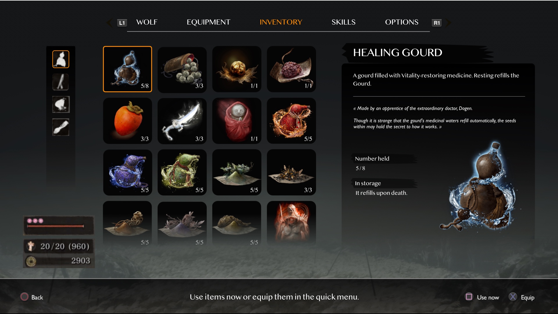
All items in the Quick Items, Key items, Upgrade materials and Prosthetic Arm Tools list are equivalent. The "Passive" category gives access to the item's information:

With one exception… those from Quick Items can also be used:

This feature is important. I don’t propose to remove it but there is something wrong with it. A lack of clarity and consistency from the UI.
The Quick Items section has a double function, passive (information) and active (use item). Why not do this from the Equipment screen or even merge the two?
The information from the Inventory screen is insufficient:
And here comes the challenge! How to improve the UI of Sekiro?
In this exercise I try to put myself in the creators’ shoes and think about how I would have designed the inventory if I had been in charge of the UX, while respecting the choices of the game design.
I looked for ideas from other games and was partly inspired by the interface of God of War (screen form Interfaceingame.com) and Horizon Zero Dawn (Pacing the flow of information in AAA Games).
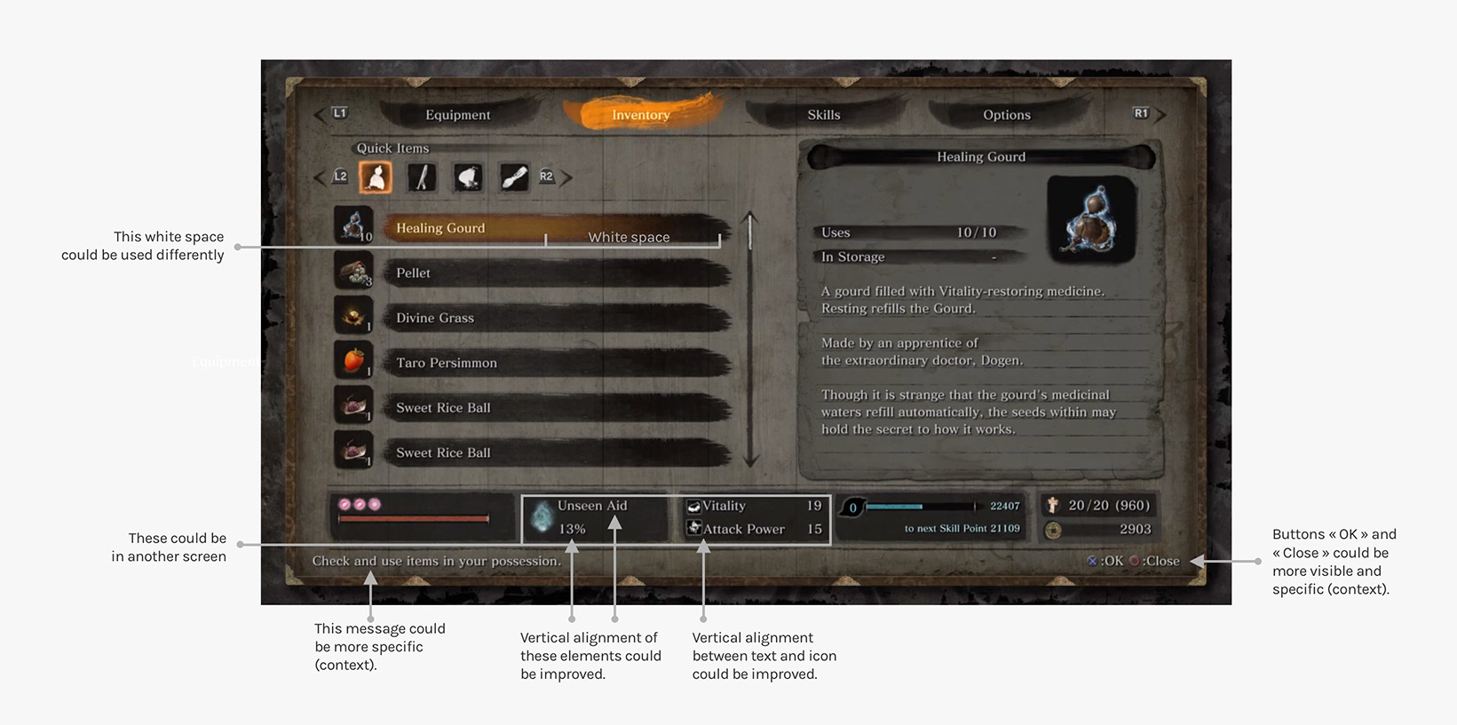
This interface lacks overall contrast and legibility.
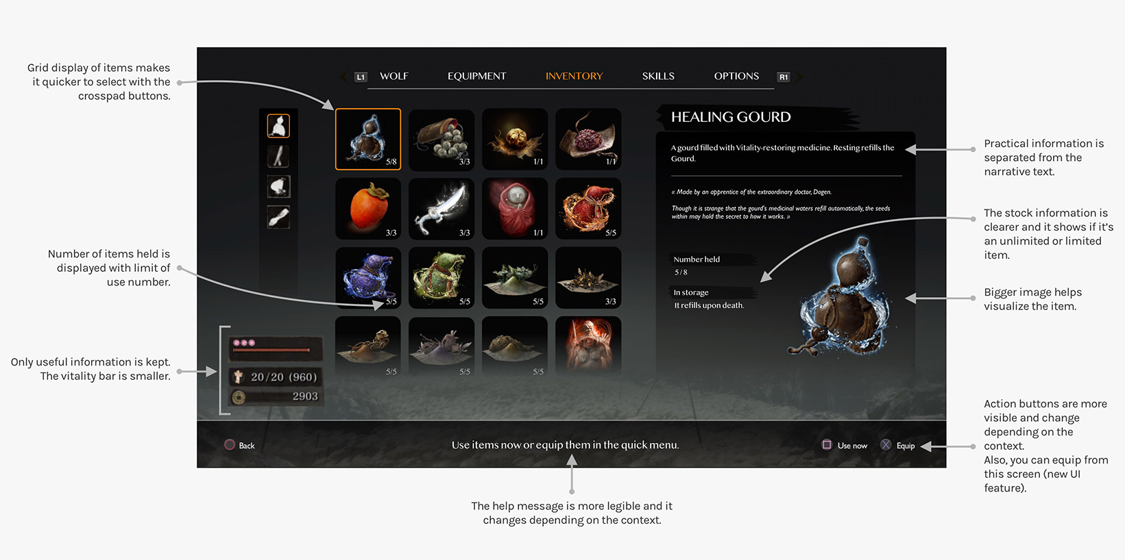
Design made with Sketch. Interactive prototype made with Protopie.
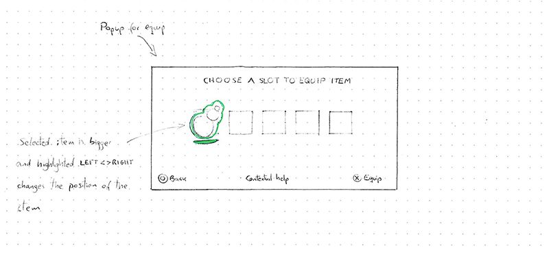
Here are the new interaction mechanics that I propose in this new interface for Sekiro.
This proposal is only a prototype.
Further research and usability testing is highly suggested.
In this study I share UX / UI thinking processes and ideas with respect to the exceptional work of Miyazaki and his team.
There is no such thing as a perfect experience. This exercise is incomplete and there are more questions than answers. With an in-depth analysis of the information architecture (for example using card sorting according to Nielsen Norman), a more developed prototype and well-structured user tests, I could go even further. But I’ll stop here 😉.
Are you a Game Designer, UX Designer or passionate gamer? Contact me to exchange and share your opinion!
Posted on December 20, 2020 By Maga
Categories: Personal, UX, Video game